Light and Dark mode are not enough
Light and dark modes in operating systems and websites are usually implemented with pure black on pure white background, or the other way around. Sometimes both of those make reading hard.

A few days ago I put out a poll on Mastodon asking folks how they feel about light and dark modes for operating systems and/or websites. This is the end result:
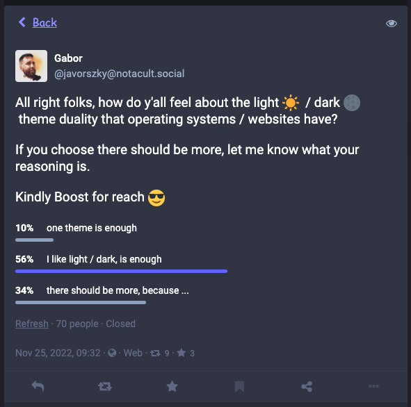
This is by no means a scientific study, as I only reached 70 people, but the responses were interesting: more than half were of the opinion that light and dark are enough.
Some of the responses suggested that they only thought of this theming from the point of “does this look cool?” design. A fair number did not consider the accessibility implications of the question.
My original intent was to figure out whether people see (pun intended) anything wrong with the current light / dark theme.
Current light / dark implementations
Most of the websites I’ve seen use black on white for light, and white on black for dark themes, and while as a box ticking exercise it certainly achieves a separate light and dark theme, it’s still kind of hard to read.
I admit I also made the mistake (though questionable whether it’s a mistake) of buying a monitor that's essentially two 1440p monitors stacked on top of each other. It’s an LG DualUp. I get 2560x2880px in a 16:18 aspect ratio in a physical 28" size. That also means that the pixel density is significantly higher than my usual full HD 27" monitors, and given I sit about a meter away from the monitor seeing things on it is getting hard. I’m also 38 years old with a -1.25 on my eyes, slight astigmatism.
Neither light, nor dark mode works for me. They are both somewhat uncomfortable to read.
Light mode is uncomfortable
I mainly use light mode on my computer except for the code editors / terminals. System theme, websites, discord, everything is light theme, mostly because reading things is less uncomfortable than dark mode.
There are two ways light mode is uncomfortable: when the brightness of the display is up and when the brightness of the display is down while trying to solve the issue the first one causes.
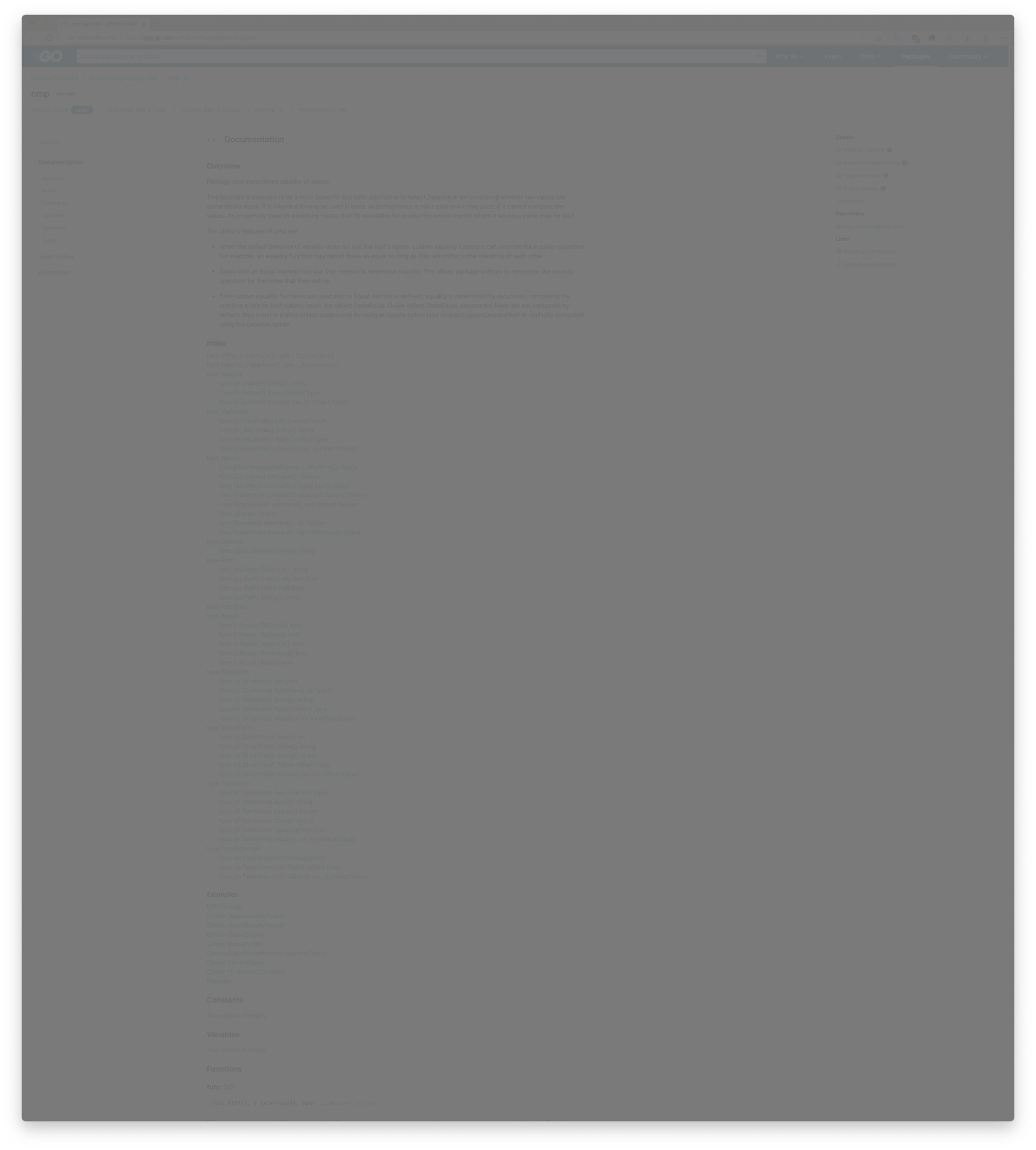
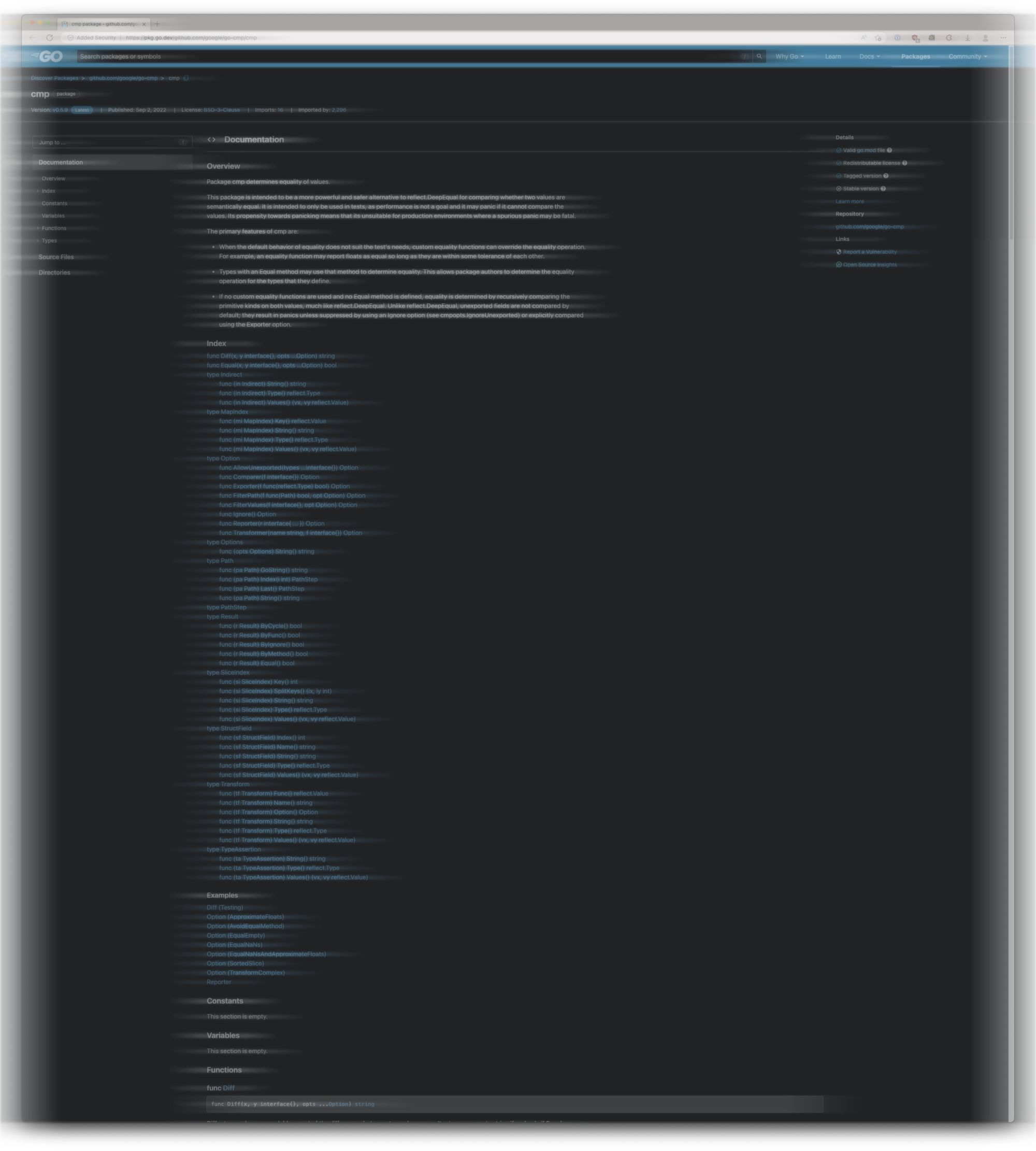
When the screen is bright, a full white page feels like an interrogation light. It’s entirely too bright to look at and as a result it creates artefacts in my eyes: dark spots dancing, light burn. I tried to approximate what the documentation page of the cmp package on golang’s documentation looks like. Behold, it is a large image. Remember, this is a 2560x2880px image!
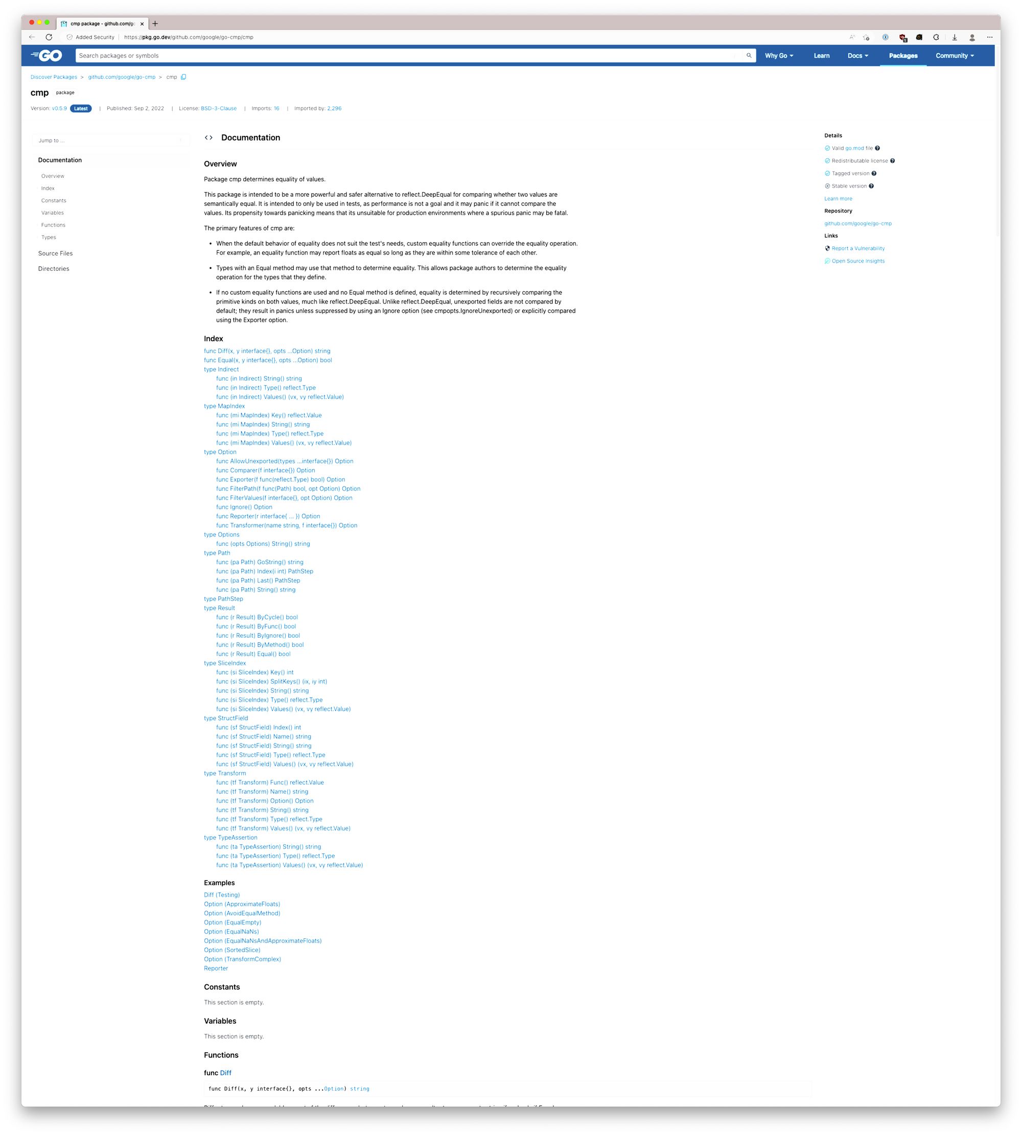
Compared to the original, this image has a lot more glow and burn on the whites. The text, regardless of its colour, is trying to sink into the vast white goop that is the background.
This is even worse when the ambient light around me is dark.
Okay, so let’s solve this by turning down the brightness of the monitor!
When the screen’s brightness is turned down, so it no longer causes strain because of the many lumens into my eyeballs, I have trouble making out what’s what on the site. Here’s what I see. Or rather what my brain sees. See how easily you can read the text:
This is obviously not great. It is very hard to make out anything, so I just end up turning the brightness back up. There is no setting where I can comfortably have my contrast and for the brightness of the screen to not hurt.
There is however several points where the brightness already hurts but I still can’t process the information on the page. Gotta love my eyes!
Naturally the solution is dark mode!
Dark mode is uncomfortable
When the brightness of the screen is down, it suffers from the same low contrast as above.
When the screen’s brightness is up, my eyes have a different artefact. As there’s such a stark contrast between the black background and the white text, after some time I get what I would describe as window-blinds effect. Phantom horizontal lines of light overlaid onto the screen I’m actually trying to read. It looks somewhat like this:
I can’t show what happens when my eyeballs saccade, but the white blurry lines jump with it, then slowly drift, and then jump again.
What can be done to fix this?
I’m aware that my unique disability of my vision is probably not on the radars of anyone besides myself, and that it is unfeasible technically for companies and individual people to design their interfaces such that it will work for me, nor am I under the illusion that I’m important enough to drive change.
I did want to highlight that the solutions people have for disabilities might not actually solve them at all, even when they tick all the boxes for AA or even AAA WCAG requirements. I’m not an accessibility expert though, so mostly I’m talking to you, a designer, a developer. I want you to not respond to a report from someone that they can’t use the site with “but it’s accessible because AA / AAA!!”
But if you do have the bandwidth, I’m personally a big fan of pastel colours as they aren’t oppressive even when the brightness of the screen is turned up to its highest setting. You can still have the required contrast ratio, while also not burning the retinas of some of your users. You could have the pastel theme next to the white-light and black-dark duality, or you could have a light pastel as your light mode, and a dark pastel as your dark mode.
But more importantly, I would like people to think of accessibility before the “it looks cool!” part of the design comes to mind.
Hope there was something you could take away from this. And as always, thanks for reading!
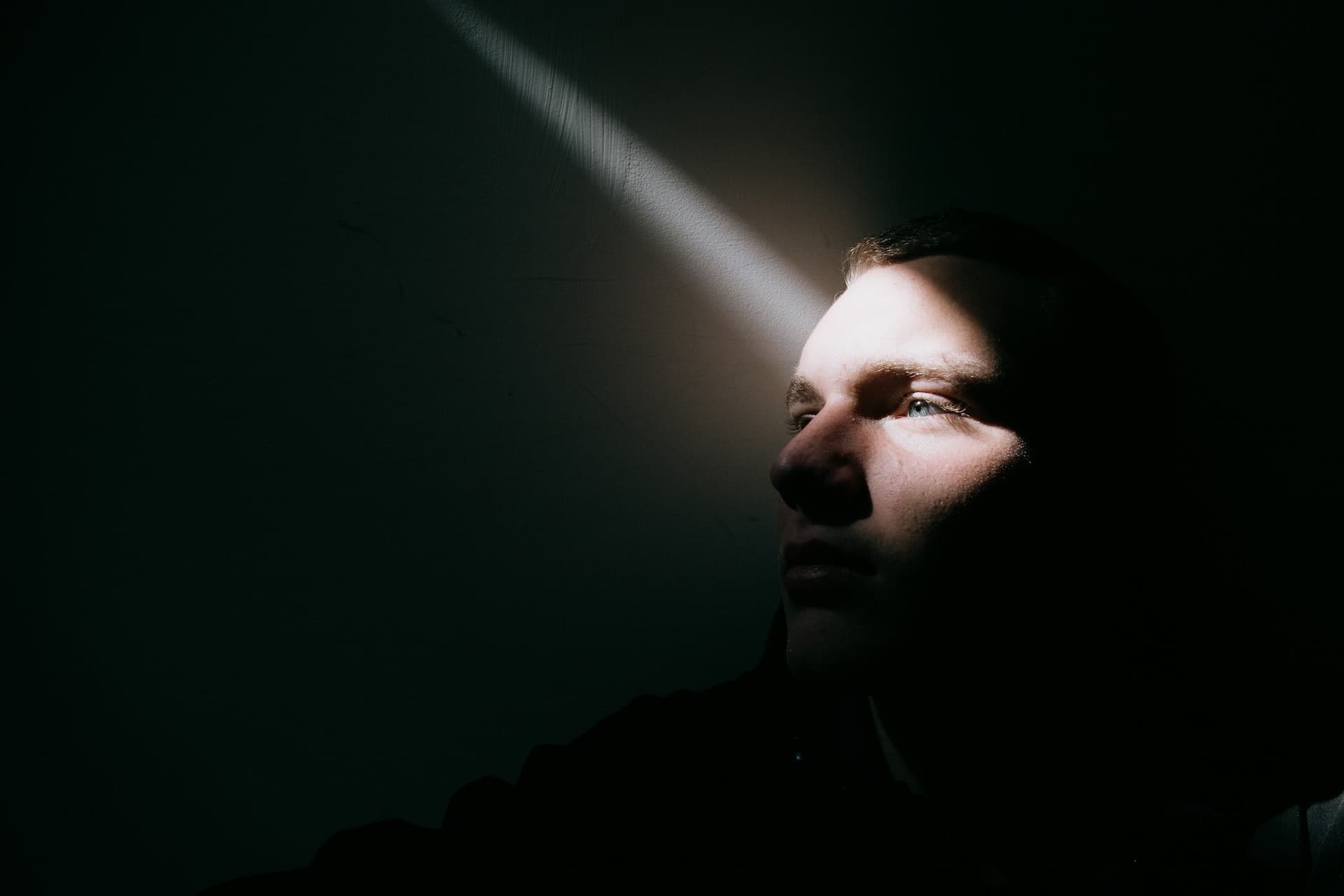
Feature image photo by Sinitta Leunen on Unsplash